Fall for Color: Eight Colors We Love for Autumn Events
Hold onto your linens, folks—Fall 2024 is all about embracing a spectrum of colors that practically ooze warmth, nostalgia, and elegance, transforming any gathering into a visual feast. This season, our color inspirations range from the comforting and cozy tones of “café core” to the invigorating and lush shades of moss green. We’re absolutely mad for marigold and foliage hues (seriously, can’t get enough), enchanted by pastels (yes, pastels for fall—deal with it), and perpetually in love with the timeless contrast of black and white (because classics never die).
Neutrals are finally getting that sophisticated makeover they’ve been begging for, and gold accents? Oh, they’re adding just the right touch of luxury to make everything feel a bit more opulent. So, buckle up and let’s dive into these delightful color trends that are poised to elevate your fall events from ‘meh’ to ‘marvelous’ with a unique and stylish flair.

Cue the Café Core
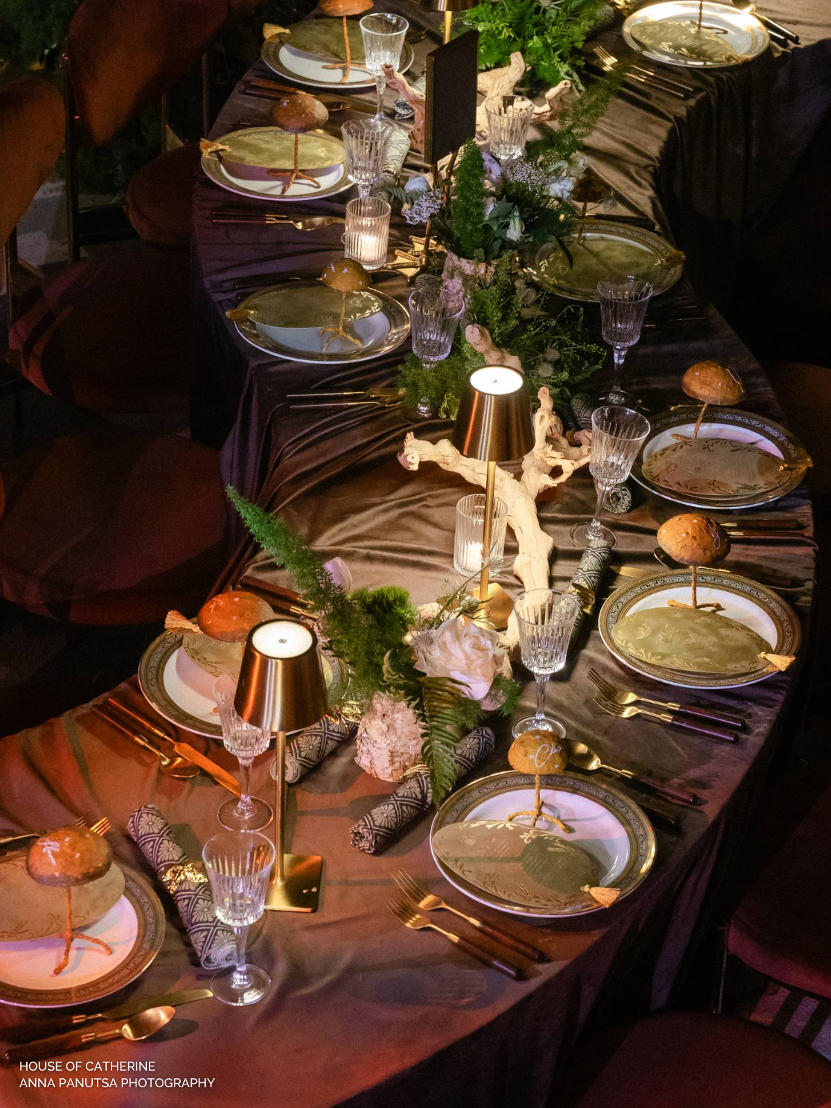
Sip on this! Something spectacular is brewing in the color sphere… decadent coffee-colored hues are taking over events this season, and we couldn’t be more excited. Think mocha, cappuccino, and espresso tones offering their warmth and sophistication to your gatherings. We’re absolutely feening for luxe velvets in rich brown hues—hello, Velvet Hazel and Cafe Noir Velvet linens and understated favorite like our textured Riga Sand. These beauties pair perfectly with fall-themed prints and patterns (Weston Wheat Plaid, Rustic Plaid Midnight and Rustic Plaid Moss, anyone?). So go ahead, indulge in these sumptuous shades, and watch as your event transforms into a cozy, stylish haven that guests will rave about. Because, let’s be honest, who can resist the allure of a perfectly brewed color palette? Certainly not us!

Have Fun with Foliage Hues
Foliage hues are the heart and soul of any fall fête, and this year is no exception. Whether you want your table to embrace all the leafy tones (think Denver Chestnut) or prefer to keep it cool with a fall plaid (hello, Weston Wheat Plaid), there are endless ways to outfit your tablescape with the season’s best colors. Want to make a bold statement with just a touch of autumnal charm? Try our Velvet Rust, which casts the perfect copper color onto any tablescape. Our Callie Honey and Velvet Marigold napkins offer a cheerful golden accent to place settings, bringing that fresh fall vibe. For those who adore marigold hues without being too over-the-top, our new Nora Celedon is a must-have, featuring a folksy floral print in rich olive and mustard tones. Pair this new fave with our new Madeline Marigold Stripe napkin for a playful mix-and-match look, or use both patterns in their pillow counterparts on your lounge for that perfect fall feel. Embrace the warmth and vibrancy of marigold this season and watch your events come to life.

Make it Mossy
This fall, we’re seeing green, and not just any green—in the best way possible. Verdant shades have been a staple this 2024 event season, and it’s easy to see why. Who doesn’t love a little nature infusion? Seriously, am I right?! This season, we’re diving headfirst into warm green hues and moody accents, all brought to life through bespoke tableware that screams effortless fall chic. Picture this: luxe Velvet Evergreen and sophisticated prints, like our Magnolia Fog linens and napkins, draped across your table, creating an ambiance that’s both elegant and inviting.
But wait, there’s more! If you’re craving a look that’s a bit more modern and delightfully mix-and-match, try pairing our Fitzgerald Matte Gold with the new Kennedy Stripe Moss napkins (or switch it up and do the reverse!). It’s all about combining those rich, lush greens with a hint of glamour, achieving that perfect balance between nature’s tranquility and contemporary flair. So go ahead, embrace the green scene this fall, and watch your events transform into a verdant wonderland that’s as refreshing as it is stylish.

A Black & White Affair
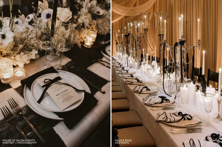
Let’s face it, the black and white color palette will always be in style, and we are totally here for it! This year, we’re seeing this classic combo making waves in a couple of fabulously chic ways. For those who love making a bold statement, our Helena Midnight is an absolute showstopper with its striking prints. Prefer something a bit more understated yet sophisticated? Enter the Lessing Black Stitch Napkin, a subtle nod to the timeless elegance of black and white.
But wait, there’s more! White textured linens like our Caterina White or Gracie Pearl White linens bring a touch of refined simplicity to any setting. And let’s not forget those bold table accents that add just the right amount of drama without saying a word. Whether you go for the daring or the demure, black and white will always have that seasonless, timeless ring that we just can’t resist.

Pretty in Pastels
Pastel palettes don’t have to be limited to spring soirées. There, we said it. This autumn, we’re seeing a delightful resurgence of soft pastel tones and prints that defy the traditional and expected foliage favorite colors. Our top picks for pastels? Well, let’s just say we’re swooning over our new Amelia Maize and Fleur Meadow paired with our new Monaco solids. And if you’re looking to elevate the classics, our new Lessing Stitch Napkins are a must-have, available in a variety of colors to perfectly complement your main table linens.
Want to create a dreamy, pastel paradise right at your table? Just add your favorite pastel-hued blooms and some colored glassware, and voilà! You’ve got yourself an enchanting setup that’s as refreshing as a spring breeze, but with an autumnal twist. Who knew pastels could be so versatile? We did, of course! So go ahead, break the mold, and let those soft, serene shades take center stage this fall.

Not-So-Boring-Neutrals
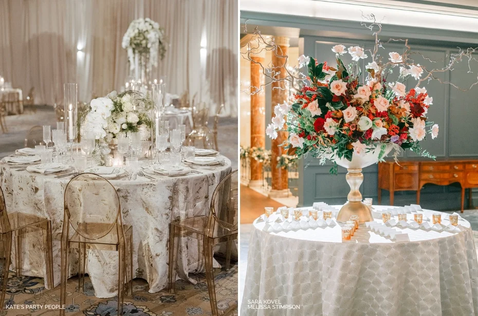
Neutrals but not a snooze fest. This season, we’re taking neutral hues from drab to fab with a splash of texture, a sprinkle of tabletop accents, a dash of florals, and more. But let’s get back to what we really care about—linens. When it comes to your table toppers, we firmly believe you can make neutrals exciting with the right textures and patterns.
First up, our Linea Sand and Montauk Sand Overlay are perfect for those wanting to infuse a little seafaring feel into their settings. Pair with our Sadie Scalloped Napkin in cream or white for a look that’s just the right amount of cutesy, yet refined. Craving something a bit more sophisticated yet textured? Our Riga Sand and Riga White linens are just the ticket, offering a solid hue with a textured hand that’s anything but boring. Pair these with our Flax Vines or Hemstitch White and Flax napkins for an effortlessly elevated feel that screams subtle elegance. Want to combine a little pattern play into your neutral settings? Our Lexington Linen strikes a balance of understated and sophistication offering a gorgeous foundation for settings. So, there you have it. Neutrals that are anything but neutral in their appeal. Go ahead, ditch the snooze-worthy beige and embrace the textured, nuanced world of not-so-boring neutrals. Your table settings will thank you.

Perfectly Pink
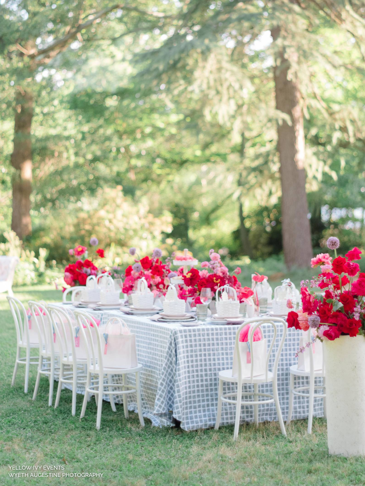
Barbicore had its moment… oh, who are we kidding? It’s still having its moment, and we are #notmadaboutit. Whether you’re going all out with bold punches of pink or keeping it soft and subtle with blush touches, this rosy hue has so much potential this fall.
Feeling flirtatious? Use our Kelly Sheer White and add a pink underlay for an irresistibly coquette look. Want to go full-on blush? Dress your tables from top to bottom in our Velvet Blush linen or add a little interest with Evelyn Rose, featuring a delicate watercolor floral print. This look is pure magic, combining the dreamy elegance of soft pinks with the rich texture of velvet. Ready to make a statement with pink? Pair our Velvet Magenta and Penelope Pomegranate linens for a bold, vibrant look that’s sure to turn heads.
So, why not embrace the pink revolution? After all, who says you can’t have a little fun with your fall decor? Pink isn’t just for spring anymore; it’s here to make your autumn events fabulously rosy and delightfully unexpected.

Go for Gold
Nothing says luxe like gilded accents, and when it comes to your table linens, they bring the perfect touch of opulence to your fall events. From the sleek modern metallics of our Stella Champagne and Radiance Gold to the botanical-inspired prints with gilded touches like our Palmiers Slate, these selections add a sophisticated and lavish flair to any setting. Gilded accents not only elevate the visual appeal but also create an ambiance of elegance and grandeur. Whether you’re hosting an intimate dinner or a grand celebration, incorporating these luxurious linens will ensure your table settings leave a lasting impression.

Get Down with Mix-and-Match
Why settle for boring when you can be fabulous? Our new coordinating collection for fall allows you to mix-and-match like a pro. Picture this: folksy floral prints like our new Nora Celedon or Emilie Dove Grey paired with our new bold striped Madeline Marigold Stripe, luxe Cafe Noir Velvet cozied up next to elevated Rustic Plaids. Use one (or all!) of these stunning prints as your table linens, throw in a complementary pattern for napkins, and top it off with a third linen for your cocktail tables. Voilà! You’ve got a cohesive look that’s as interesting as your guest list. Who knew setting the table could be this much fun? For more inspiration on event design and decor ideas, check out Now Trending: 2024 Event Design & Decor Ideas.
Jul. 24, 2024


